The Gallery
Category
Region
Country
School
Status
Order by Behance appreciations
Order by Submitted date
 Filter by Portfolio
All entries
 Filter by XD
All entries
Entries found
Loading entries
IGTracker
Hyouk Seo
University oh Incheon, Korea
Commercial - Web / App / Game Design
Category Semifinalist
IGTracker - Instagram tracking application UX Case Study and Design Process - ; IGTracker is an application for teens in USA who love to using SNS applications and spend time with them. Our application will help them to easily get insight about their account’s statistics and interests with clean and detailed user interface.

IGTracker — UX Case Study
Instagram tracking application
Inspiration
Lots of teens using SNS applications nowadays. They love to use SNS applications like Twitter, Facebook and Instagram. And they really care about their account’s popularity and interest about their account from others. Most of the teens that using SNS believe about ripple effects from their SNS account, and they spend a lot of time to attract more followers on their account.
Design Process
I followed IDEO’s Human-Centered Design process to make my design backed up by feedback, researches and user testing.


#1. Observation
Goal & Audience
IGTracker’s goal is very straightforward and simple — To analyze and track user’s Instagram account’s statistics like Followers, Following, Likes, Comments, etc. Our main target are teens, mostly from USA and aged between 13~25. Also main audience of Instagram, Snapchat and Facebook. Above all, Instagram is the most popular and active application between those targets. We aim our targets by providing an application, which can deeply analyzing their Instagram account’s statistics.
“Try to understand people through observing them. For example, if you’re designing a vacuum cleaner, watch people vacuum.”
Results of surveys by LendEDU
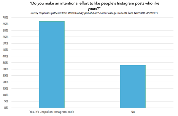
Question 1: Do you make an intentional effort to like people’s Instagram posts who like yours?
Question 2: Do you know someone who deletes Facebook or Instagram posts if they don’t get enough likes?

According to the survey by LendEDU above, it seems most of young people really cares about their Instagram account's popularity. We can find out that those Instagram users check the popularity of posts they posted. They are accustomed to do such 'work'. However, what if they can check and review their accounts overall history of statistics on a single screen, instead of checking their posts one by one?

Persona
I created a potential user of IGTracker based on our main target that I write on above paragraph. Image below is a persona of the potential IGTracker’s user.

Job Stories
I used Jobs to be done framework to understand better our mission as a sight of actual user of IGTracker.
1. When I managing my Instagram account, I want to take care about my posts and followers, So I can keep my followers following on me.
2. When I upload a new post on my Instagram, I want to get lots of Likes on it, So I can make my account more popular.
3. When someone unfollow my Instagram account without any single word, I want to track those people who unfollowed me, So I can unfollow them either or try harder to keep my followers following me.

#2. Ideation
Main purpose
IGTracker’s main purpose is to provide insights of user’s Instagram account. IGTracker analyze the account’s status like it’s Followers, Blocked users, Comments and likes. And show those information with graph and chart with clean and intuitive user interface.
Brainstorming
Our team began to brainstorming the ideas, based on observations and experiences on prior step. We focused on our target’s needs and desires. There are some points on our main targets(Teens based in USA, aged between 13~25):
1. They are used to making social networks with mobile applications like Snapchat, Instagram, Musical.ly and Houseparty.
2. They love interactions and gestures like Swiping, Pinching, Expanding, Animations and those are completely natural to them.
3. They are expert on those operation system, applications and interactions, but still don’t want to be difficult by complex and hard UX.


Quick UI Concepts
IGTracker is going to release only for iOS platform. Based on iOS Human Interface Guidelines, our team started to make some guidelines for IGTracker application:
1. White/negative space clean design, with bold fonts and emoji(Inspired by Snapchat).
2. Organized, spaced and easy to read with contrast colors, with the minimalist approach for readable data and graph at a glance.
3. Focus on young designs and not only functional design due to our main targets have standards from other applications like Instagram, Snapchat or Facebook.

#3. Rapid Prototyping
Lo-Fi Prototypes
For a quick user testing, our team created some rough prototypes. With InVision application, made them clickable, and started to test it with some testers who love to use Instagram, and care about their popularity. To make sure that our solution is on our target, we focused not to make a detailed and perfect solution and prototypes.

_a. Dashboard
After the user logs in, this screen is the first screen that user see. In this screen, we summarize the main information that the user needs by graphs:
ㆍFollowers Growth
ㆍUnfollowed Me
ㆍNot Following Me Back
ㆍBlocked Me
ㆍDeleted Comments/Likes
It’s not a scrollable screen. We are showing fixed number of mandatory items, to give the user the feel of control on what’s happening with user’s account analytics, on a high level.
For the very first time, we had more graphs on the main screen for more insight than the current design. However, after thinking carefully about what really users need, we decided to offer only 5 graphs in total: 'Followers Growth', 'Unfollowed Me', 'Not Following Me Back', 'Blocked Me' and 'Deleted Comments/Likes'.
1. Followers Growth
The number of followers that are heavily exposed at the top of their Instagram profile is the indicator for them that indicates their popularity on the Instagram. They are very interested in the number of their followers and are sensitive to changes of the numbers. In the 'Followers Growth' graph, you can see at a glance statistics about the overall followers change of the Instagram account.
2. Unfollowed Me
It's an interesting phenomenon, but people really want to know about other people who no longer follow their Instagram account. They feel that their Instagram account is popular when there are many people who follow their account than they follow, and feel satisfied about that. Therefore, they want to find unfollowed users and unfollow them equally. The 'Unfollowed Me' graph provides insight into those statistics.
3. Not Following Me Back
This is similar to let the 'Unfollowed Me' graph on the main screen. When they follow someone, they want him/her to follows them back. The number of followers is very important to them. If someone does not follow me back, they will want to know who it is.
4. Blocked Me
It is the worst situation. Instagram does not tell users who blocked them. Everyone on Instagram wants to know how many people have blocked them, and who has blocked them.
5. Deleted Comments/Likes
As you can see from the statistics above, the popularity of your post is very important to them. They want to delete posts that do not get satisfactory 'Likes' and 'Comments'. The 'Deleted Comments/Likes' graph shows at a glance the number of posts that have not received satisfactory 'Likes' and 'Comments' and number of deleted Comments / Likes.
_b. Audience/Posts Screen
This screen will have a list of ‘insights’ and ‘analytics’ about the ‘Tab’ that the user just tapped (either ‘Posts’ or ‘Audience’) that the user can access. It’s basically a scroll view that shows the available data options we provide. User can switch to this screen using the Tab Bar, clicking ‘Posts’ or ‘Audience’ tab (both are same screen, only with different data). When pressing one of the actions (tab), it’ll take him to the next screen(c.) in our list.
_c. Inner Analytics Screen
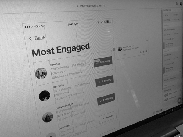
This screen will display the information that user just tapped on prior screen (b.). It’s basically a scroll view that shows a list of the requested information by the user. On this screen, each user profile list contains:
ㆍName of the user
ㆍIf the user follows me or not
ㆍThe amount of the likes & comments user gave me

#4. User Feedback
Usability Testing
With the prototypes we created on prior step (#3.), our team had some usability tests with numerous testers. There’s only one condition for testers — love Instagram and spend a lot of time to manage their account on Instagram. This step is critical for us to get more ideas, feedback and information and to better understand the target’s needs.
“If you want to improve a piece of software, all you have to do is watch people using it and see when they grimace, and then you can fix that.” — David Kelley

Feedback
We got some feedback from users during the usability testing. Here’re the lists that we summarized from main feedback.
1. Need ‘Switch Account’ button on Dashboard Screen for users who have more than just one account.
2. Screens are pretty ‘businesslike’ and boring; in spite of the main targets are teenagers.
3. ‘Follow’/’Unfollow’ button is needed on ‘Inner Analytics Screen’ to make user able to follow or unfollow other users immediately.

Improvements
Based on tester’s feedback and opinions, some features are re-designed with Hi-Fi prototypes.

_a. Dashboard
We added ‘Switch Account’ button on top of the screen for users to switch their accounts if they have more than 1 account. It’s similar with Instagram application — just click and tab another account to switch — so the users can use this feature easily. If the user wants to add a new account, simply tab the last list of the menu ‘Add Account’.

_b. Audience/Posts Screen
No big change has happened. Just organized each tabs (lists), added some details like arrow and font variation.
_c. Inner Analytics Screen
‘Follow’ and ’Unfollow’ buttons were added on the right side of each user’s list to make user follow or unfollow the other users on this screen, without exit the IGTracker application. We also added more details like numbers of follow and followers of users in the list.
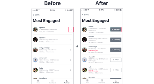
By providing ‘Follow’ and ‘Unfollow’ buttons, users don’t need to switch from IGTracker to Instagram, if they want to follow or unfollow the user on the list. In addition, users can check that the other user follows me or not.


Thumb zone
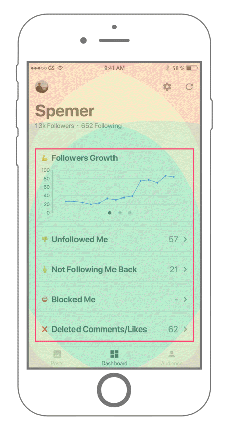
On the main screen(with the graphs), it's important to keep users can control and watch every analytics and graphs easy and comfortable. Every main activities and information that users need and want to know are on the main screen. I referenced an article of Samantha about 'thumb zone' for this framework.


#5. Iteration
Based on Feedback
With Hi-Fi prototypes, we built another clickable prototype for next usability testing. From now on, keep testing and reflecting user’s feedback is really important for us before our application gets ready to be used. We’re still keep working on this step for more usability.


#6. Implementation
Work In Progress
Although we’re still work in progress, validated data from each steps are implementing right after tests. We’re continuing to observe our testers to validate our application’s usability. Clickable mock-up below is the latest application’s prototype. We’re always opened for many user’s feedback and opinions.

What I’ve learnt
The targets of IGTracker are ‘Teens’ and ‘College students’. We interviewed them (including our friends), observed them, looked at surveys about their use of Instagram, and spent a lot of time thinking about what they really needed in managing their Instagram account. Through observing the actual users and empathizing with them, we felt the importance of insight that they could gain. In addition, found the insight can make the product useful and good to use.

Takeaway
IGTracker
IGTracker is an application for teens in USA who love using SNS applications and spend time with them. Our application will help them to easily get insight about their account’s statistics and interests with clean and detailed user interface.
